Choosing the right colours for your home is one of the most important design decisions you’ll make. The colours you select influence mood, perceived space, lighting, comfort, and even property value. With evolving design preferences and new colour trends emerging in 2026, homeowners are looking beyond simple paint choices to create personalized, functional, and visually stunning interiors.Before finalising your colour palette, it’s important to understand how a professional home interior designer in Bangalore can help create a cohesive design that matches your lifestyle and space requirements.
This comprehensive home colour selection guide will help you understand colour psychology, lighting effects, room-specific recommendations, and the latest colour combinations ideal for Indian homes, apartments, and luxury villas.
What Is Home Colour Selection and Why Does It Matter?
Home colour selection is the process of choosing interior and exterior colours that enhance aesthetics, functionality, mood, and comfort while complementing lighting, architecture, and lifestyle needs.
Why It Matters
Colours affect:
- Emotional well-being
- Room perception
- Natural light reflection
- Productivity
- Relaxation
- Home value
Who Should Use This Guide?
- New homeowners
- Apartment owners
- Villa owners
- Families renovating homes
- Interior design enthusiasts
Understanding Colour Psychology for Home Interiors
Colour psychology helps homeowners choose colours based on the emotions and experiences they want to create within each space.
Common Colour Meanings
Colour | Psychological Effect |
Blue | Calm, relaxation |
Green | Balance, wellness |
Beige | Warmth, sophistication |
White | Spaciousness, cleanliness |
Grey | Modern elegance |
Yellow | Energy, positivity |
Terracotta | Comfort, grounding |
Sage Green | Nature-inspired serenity |
Key Takeaways
- Bedrooms benefit from calming colours.
- Workspaces perform better with balanced palettes.
- Living rooms should encourage interaction.
- Kitchens often benefit from energetic tones.
How Lighting Affects Home Colour Selection
The same colour can appear dramatically different depending on natural sunlight, room orientation, and artificial lighting.
North-Facing Rooms
North-facing rooms usually receive cooler and softer natural light throughout the day. Warm shades like warm beige, cream, and soft taupe help balance the cool lighting, making the space feel brighter, warmer, and more inviting.
South-Facing Rooms
South-facing rooms get abundant sunlight for most of the day. Colours such as sage green, grey, and muted blues work well because they soften the intensity of natural light while creating a calm and comfortable atmosphere.
East-Facing Rooms
East-facing rooms enjoy bright morning sunlight and softer light later in the day. Light neutrals and warm whites enhance the natural brightness, making the room feel fresh, airy, and welcoming from morning to evening.
West-Facing Rooms
West-facing rooms receive strong afternoon and evening sunlight, which can create a warmer appearance. Cool greys and soft greens help balance the warmth and keep the space feeling comfortable and visually balanced.
Key Takeaways
Before finalising any wall colour, test paint samples on your walls and observe them at different times of the day. Natural and artificial lighting can significantly affect how a colour appears. Professional lighting and decor planning ensures colours, lighting fixtures, and furnishings work together to create the desired mood and ambience throughout the home. Also, consider your LED light temperature, as warm and cool lighting can change the overall look and feel of the room.
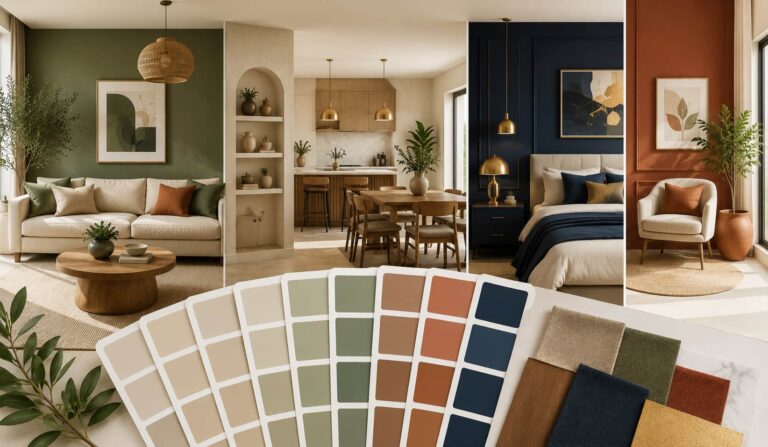
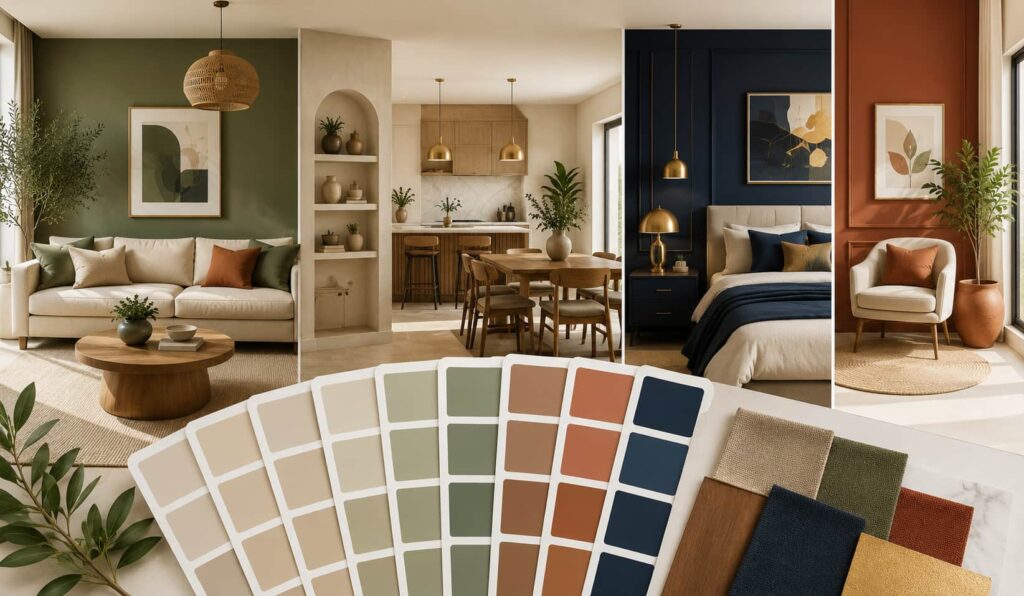
Best Home Colour Combinations for 2026
The most popular home colour combinations in 2026 focus on wellness, sustainability, and natural inspiration.
Trending Combinations
Sage Green + Warm White
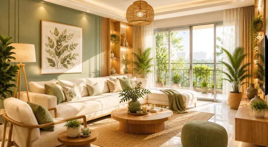
This timeless colour combination creates a calm and refreshing atmosphere. It works beautifully in living rooms and bedrooms, bringing a natural, airy feel while maintaining a clean and elegant look.
Greige + Walnut Wood
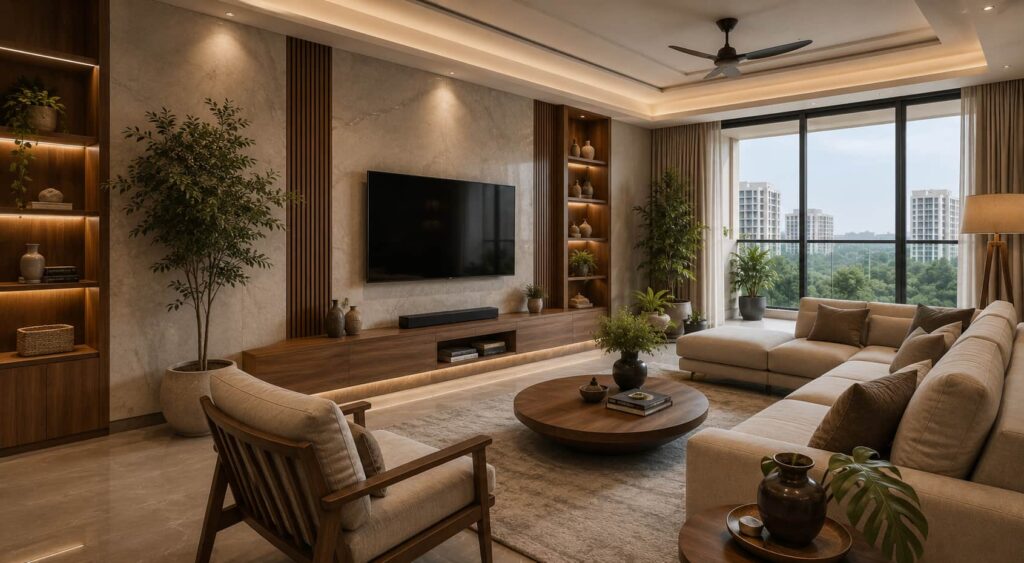
A perfect blend of sophistication and warmth, greige paired with rich walnut wood adds depth and character to a space. It is especially popular in luxury homes and modern apartments seeking a premium, contemporary aesthetic.
Terracotta + Beige
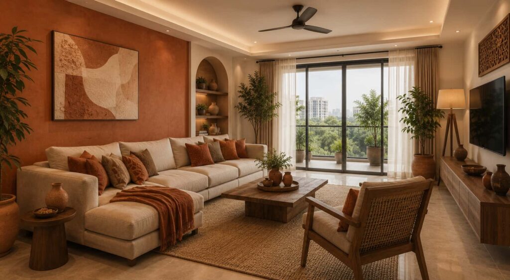
Terracotta brings warmth and earthy charm, while beige keeps the space balanced and bright. This combination is ideal for Indian homes and contemporary interiors, creating a welcoming and stylish environment.
Navy Blue + Gold Accents
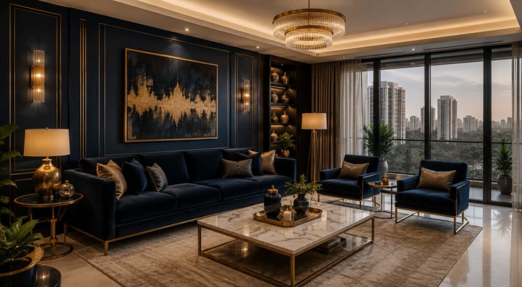
For a bold and luxurious statement, navy blue paired with gold accents delivers timeless elegance. It is best suited for premium interiors and feature spaces where you want to create visual impact and sophistication.
Olive Green + Sand
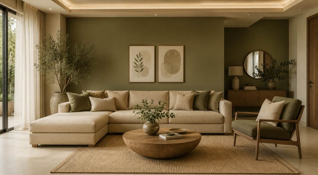
Inspired by nature, olive green and sand tones create a relaxing and organic atmosphere. This combination is perfect for biophilic designs and nature-focused homes, helping bring the outdoors inside while maintaining a modern feel.
Room-by-Room Home Colour Selection Guide
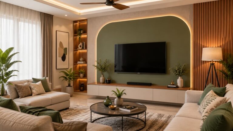
Living Room
The living room is where family and guests gather, making colour selection especially important. Shades like warm white, greige, sage green, and soft beige create a bright, welcoming atmosphere while enhancing the sense of space and elegance.
Bedroom
A bedroom should feel calm and restful after a long day. Colours such as dusty blue, lavender grey, muted green, and warm beige promote relaxation, reduce visual stress, and help create a peaceful environment for better sleep quality.
Kitchen
The kitchen benefits from colours that feel fresh and clean. White, light grey, mint green, and soft yellow brighten the space, improve the feeling of cleanliness, and create an inviting area for cooking and dining.Colour selection also plays an important role in creating a functional kitchen. Learn how to choose the perfect modular kitchen design for your home for a balanced and efficient cooking space.
Children's Room
Children’s rooms should inspire imagination while maintaining a comforting atmosphere. Soft blue, pastel green, peach, and lavender add gentle colour, encourage creativity, and create a cheerful yet soothing environment.
Home Office
A productive workspace starts with the right colour palette. Blue-grey, sage green, and neutral taupe help improve focus, reduce distractions, and create a balanced setting that supports concentration and efficiency throughout the day.
Home Colour Selection for Apartments vs Villas
Factor | Apartments | Villas |
Space | Compact | Spacious |
Light | Limited | Abundant |
Recommended Colours | Light neutrals | Rich layered palettes |
Accent Colours | Minimal | Bold options |
Wall Treatments | Simple | Feature walls |
Decision Framework
Choose lighter shades for apartments to maximize visual space and deeper tones for villas where natural light is abundant.
If you’re designing a new apartment or villa, these modern home interior design ideas can help you create a colour palette that complements contemporary layouts and furniture styles.
Best Colour Combinations for Indian Homes
Indian homes benefit from colour palettes that complement tropical lighting, cultural preferences, and architectural styles.
Popular Combinations:
- Ivory + Walnut Brown
- Beige + Olive Green
- White + Terracotta
- Sand + Charcoal Grey
- Cream + Teak Wood
Vastu-Friendly Colour Suggestions
- North: Light green
- East: White
- South: Coral accents
- West: Soft grey
Home Colour Trends 2026
The biggest home colour trends in 2026 focus on wellness, nature, sustainability, and timeless luxury.
Trend Highlights
- Earth-inspired palettes
- Warm neutrals replacing stark whites
- Biophilic greens
- Clay and terracotta shades
- Layered monochromatic designs
- Textured colour finishes
- Sustainable paint selections
Looking for more inspiration? Explore these interior colour combinations for modern homes that are trending across Bangalore apartments and luxury villas in 2026.
Common Home Colour Selection Mistakes
Choosing Colours Before Evaluating Lighting
Natural and artificial lighting can dramatically change how a paint colour appears. A shade that looks perfect in a showroom or online may look completely different in your home, so always assess colours under your room’s actual lighting conditions.
Ignoring Existing Furniture and Décor
Your wall colours should work harmoniously with existing furniture, flooring, curtains, and décor elements. Choosing colours without considering these features can result in a disconnected and unbalanced interior design.
Using Too Many Accent Colours
While accent colours can add personality, using too many can make a room feel busy and overwhelming. Limiting your palette to a few complementary colours helps create a more cohesive and visually appealing space.
Following Trends Without Considering Longevity
Trending colours may look attractive today but can quickly feel outdated. Choosing timeless and versatile colour palettes ensures your interiors remain stylish and relevant for years to come.
Skipping Paint Sample Testing
One of the most common mistakes is selecting a colour without testing it first. Apply large paint samples on different walls and observe them throughout the day to see how changing light affects their appearance before making a final decision.
Expert Tips for Choosing the Perfect Home Colours
- Follow the 60-30-10 colour rule.
- Create a mood board first.
- Test samples at different times of day.
- Consider flooring and furniture.
- Use consistent undertones throughout the home.
- Prioritize comfort over trends.
Home Colour Selection in Bangalore: Local Design Considerations
Bangalore homeowners often face unique colour selection challenges due to:
- High-rise apartment living
- Mixed natural lighting
- Contemporary architecture
- Premium villa communities
- Urban luxury design preferences
Understanding the latest interior design cost in Bangalore can also help homeowners choose colour palettes, materials, and finishes that align with their budget and project goals.
Popular colour choices in Bangalore include:
- Greige
- Sage green
- Warm white
- Sand beige
- Charcoal accents
These colours work exceptionally well in modern apartments, gated communities, and luxury villas across Whitefield, Sarjapur Road, Electronic City, HSR Layout, and North Bangalore.
How Woodlab Interiors Can Help
Woodlab Interiors helps Bangalore homeowners create personalized interior colour schemes that balance aesthetics, functionality, lighting conditions, and lifestyle requirements. Homeowners looking for end-to-end solutions often choose one of the best interior design companies in Bangalore for expert guidance and execution.functionality, lighting conditions, and lifestyle requirements.
Their design process includes:
- Colour consultation
- Space planning
- Lighting assessment
- Material coordination
- Customized mood boards
- End-to-end interior execution
This ensures every room achieves visual harmony while reflecting the homeowner’s personality and preferences.
Frequently Asked Questions
How do I choose the best colour for my home?
Start by evaluating natural light, room size, furniture, and desired mood. Choose a consistent colour palette and test samples before making a final decision.
Which colour is best for a living room in 2026?
Warm whites, greige, sage green, and soft beige are among the most popular living room colours due to their versatility and timeless appeal.
What are the latest home colour trends in 2026?
Earthy tones, biophilic greens, warm neutrals, terracotta shades, and layered monochromatic palettes are leading interior design trends.
Which colours make a room look bigger?
Light colours such as white, cream, beige, and pale grey reflect more light and create the illusion of a larger space.
How important is lighting when selecting paint colours?
Lighting is critical because it changes how colours appear throughout the day. Always test colours under actual room lighting conditions.
Should every room have the same colour?
Not necessarily. Rooms can have unique colours while maintaining a cohesive palette through consistent undertones and complementary shades.
What is the 60-30-10 colour rule in interior design?
The 60-30-10 rule uses 60% dominant, 30% secondary, and 10% accent colours for balanced interiors.
Can professional interior designers help with colour selection?
Yes, interior designers recommend colours based on lighting, furniture, space, and your overall design goals.