Creating a harmonious and visually captivating home begins with choosing the right colour combinations. Colour does more than decorate—it sets moods, reflects your unique style, and creates a cohesive, welcoming environment. Whether you are refreshing a single room or redesigning your entire home, well-planned colour choices grounded in psychology, trends, and practical insights can transform your interiors dramatically. This detailed guide walks you through the essential principles of colour, proven strategies, and expert tips—all supported by the latest research and market data.
The Psychology of Colour in Home Design: Why It Matters
Colour has a profound effect on human emotion, behaviour, and perception—making it one of the most powerful tools in interior design. Here is how different hues influence mood and function in your living spaces:
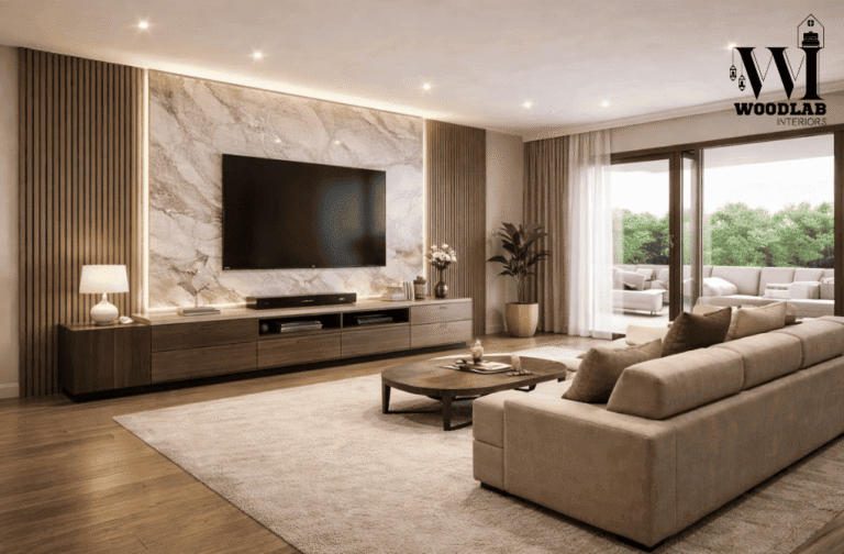
- Warm-toned hues within the orange, red, and yellow spectrum evoke feelings of energy, happiness, and social connection. Ideal for social spaces like kitchens, dining rooms, and living rooms, they create warmth and engagement. According to recent consumer surveys, 49% prefer warm neutrals such as taupe, beige, and creamy whites, drawn to their comforting and grounding qualities. Furthermore, approximately 69% of contemporary interior design projects prioritize warm, nature-inspired colour palettes that foster a feeling of comfort and security.
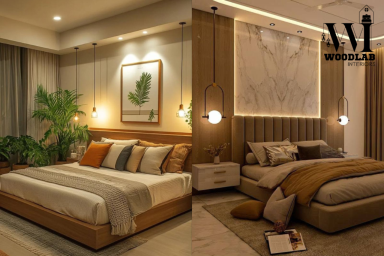
- Cool-toned Colors in the blue, green, and purple spectrum are known to create a calming atmosphere, improve concentration, and support a restful environment. Bedrooms, bathrooms, and home offices benefit from calming blues and greens. Soft pastels such as blush, lavender, and muted blues help reduce stress and create relaxing environments. These have been incorporated into 55% of living rooms and 48% of bedrooms and bathrooms for their soothing effects.
- Integration with Natural Light: Personal associations with colour and the type of natural lighting in a room alter colour perception. Warm earthy tones foster coziness, particularly where light is limited. Market research indicates that 65% of consumers actively seek interiors blending comfort with organic, nature-inspired palettes, with 60% of interior designers identifying earthy tones, greens, and browns as the defining trend for 2025.
- Colour Theory Application: Using the colour wheel, analogous schemes (colours adjacent on the wheel) create restful harmony, while complementary schemes (opposites) inject dynamic contrast and energy. Your cultural background and individual preferences also shape responses to colour, highlighting the importance of personalization.
Timeless Neutral Palettes: Creating Calm and Inviting Spaces
Neutrals are the backbone of balanced, enduring interior design, offering versatility and longevity:
- Warm Neutrals—beige, taupe, creamy whites—provide sumptuous coziness, ideal for bedrooms and common living areas.
- Cool Neutrals—greys, greiges, off-whites—inject modern elegance, fitting both contemporary and traditional schemes.
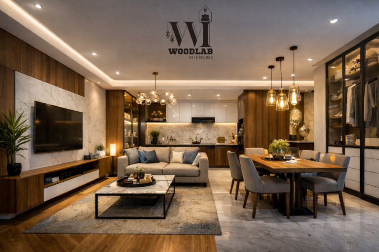
- Neutrals form the base colour palette in 72% of home interiors, serving either as standalone tones or as backdrops for vivid accents.
- Minimalist design trends emphasize whites and off-whites (ivory, eggshell, alabaster) that reflect light and visually expand rooms.
- Emerging colour preferences include deep jewel tones like eggplant, chocolate brown, terracotta, and muted blues, embraced by about 34% of homeowners for their combination of boldness and natural calm.
- An increase in “muddy,” earthy shades—complex pinks, purples, greens, and yellows with grounded undertones—reflects the rising “soft power” colour trend forecast by industry experts.
Enhancing Cohesion with Thoughtful Colour Flow
Establishing a cohesive visual flow throughout the home promotes a serene and refined aesthetic:
- Base Neutral Selection: Use a consistent neutral tone as the canvas to unify all rooms.
- Primary Colour Limitation: Limit your palette to 2–3 key hues distributed throughout different spaces.
- Seamless Shade and Tint Transitions: Variation in shades and tints enables smooth visual flow between rooms by adjusting brightness and color intensity.
- Accessories for Unity: Rugs, curtains, and wall art that echo your palette reinforce visual flow.
- Consistent Undertones: Ensure alignment of warm or cool undertones throughout paints and furnishings to achieve harmonious design.
Energizing Your Home with Bold Accents and Statements
Bold Colour Injections: Dynamic Personality and Modern Impact
| Colour Combination | Common Usage | Prevalence |
|---|---|---|
| Emerald Green + Fuchsia | Statement furniture | 39% of bold homeowners |
| Coral + Teal | Social and creative spaces | 29% of new décor projects |
| Plum Purple + Gold | Luxe dining and bedrooms | 24% of designers citing impact |
| Canary Yellow + Charcoal | Modern industrial aesthetics | 21% homeowner embrace |
| Multicolored Accents | Vibrant décor on white walls | 44% designer recommended |
The Influence of Natural Light on Colour Perception and Selection
Lighting profoundly alters colour appearance:
| Direction | Recommended Colours | Effective Outcomes | Usage % |
|---|---|---|---|
| Northern | Warm neutrals, earthy tones | Balances cooler light, invites warmth | 66% |
| Southern | Cool blues, greens | Complements bright sunlight | 68% |
| Eastern | Soft, fresh shades (peach, light blue) | Highlights morning glow | 55% |
| Western | Warm, saturated tones (red, orange) | Enhances afternoon light | 52% |
| Dark Rooms | Light-reflecting hues / bold darks | Expands or intensifies mood | 63% light / 29% dark |
Textures and Patterns: Adding Depth & Dimension
- Textured fabrics/wallpapers → Used in 60% of contemporary homes.
- Organic elements (wood, stone, ceramics) → Add warmth & natural richness.
- Layered textiles (rugs, cushions, throws) → Found in 52% of stylish interiors.
- Metallic accents (gold, silver, bronze) → Present in 39% of décor elements.
- Accent walls → Frame architectural features in 41% of homes.
- Curved furniture/architecture → A trend in 36% of designs.
- Seasonal layering → Pillows/throws favored by 47% of decorators.
Avoiding Common Colour Combination Mistakes
Successful colour design avoids pitfalls:
| Common Issue | Recommended Solution | Prevalence |
|---|---|---|
| Overuse of colours | Limit to 2–3 primary + up to 3 accents | 58% |
| Lack of contrast | Combine light, mid, and dark tones | 68% |
| Overwhelming accessories | Restrict statement pieces per space | 47% experts |
| Overlooking lighting | Test colours in natural + artificial light | 73% |
| Undermined undertones | Match warm or cool undertones consistently | 73% |
| Unappealing colours | Avoid lime green for resale (agreement among 73% of experts) | 73% |
Conclusion: Elevate Your Living Space Today with Expert Colour Combinations
Thoughtful colour choices blend psychology, style, and function to transform any home. Build your palette around timeless neutrals to form a soothing base, then layer in bold accents and textured elements to create vibrant character. Consider lighting carefully to enhance your scheme’s impact, and avoid common mistakes by maintaining cohesion and balance.
The interior design services market is projected to grow to $123.84 billion by 2029 at an 8.8% CAGR, reflecting continuing demand for professional, personalized colour and design expertise.


